

The ambiance of a home is greatly influenced by individual preferences right from the entrance. Art serves as a significant indicator, creating an atmosphere that words often struggle to encapsulate. When every artwork resonates with the inhabitants, spaces develop a sense of unity and warmth.
However, families are diverse. They encompass various ages, interests, and comfort levels. Thoughtful selections honor these distinctions while simultaneously creating a serene, unified atmosphere for everyday living.
Taste as a Foundation of Belonging
Artworks that reflect your daily experiences can transform an entryway or kitchen into a true home. A framed map from a cherished trip or a depiction of local flora acts as a common touchstone. Upon entering, visitors immediately engage with these narratives.
Focus on commonly used spaces first. The family room frequently expresses the family’s essence, while the main bedroom may convey more subtle messages. Experiment with smaller pieces before committing to larger acquisitions, such as placing printouts on the walls to assess proportions and visual appeal.
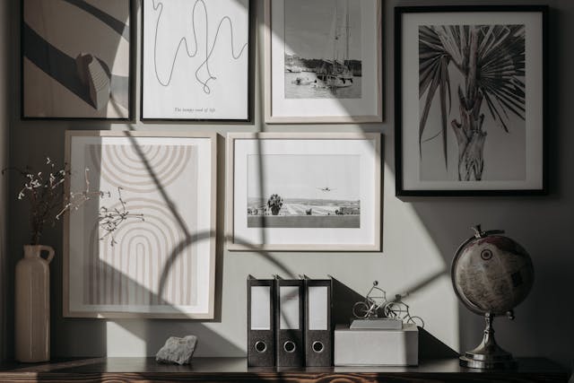
Use a singular element to unify the design. A recurring theme, like gentle curves or botanical motifs, can harmonize areas without requiring all elements to match, creating a delightful intersection of design and memory.
Creating Harmony in the Bedroom
Peaceful environments often require subtle cues. Soothing hues, reduced contrasts, and natural shapes can help calm the nervous system. Features with a hand-drawn quality promote relaxation.
Start with the wall behind your headboard. Selecting the right proportions frames the bed and directs the room’s energy. Browse for inspiration and create a shortlist of potential wall art, returning to it later with a fresh perspective. Using a digital mockup can assist in visualizing placements.
Combine artwork based on shared feelings rather than cohesive themes. For instance, a serene landscape and a soft abstract can resonate together if their styles are compatible. To minimize glare, opt for matte finishes.
The Role of Mood, Memory, and Significance
Art has the power to evoke desired emotions. Gentle abstracts can soothe a busy corridor, while a striking graphic can invigorate a slow morning. Additionally, sentimental pieces can turn a simple photo into a cherished habit.
Keep significance as a priority. Artwork created by your child at age six can be displayed alongside a professional print if the framing and spacing are thoughtfully arranged. Varied aesthetics do not equate to visual chaos when balanced appropriately.
Consider drafting a brief narrative for each room. In two lines, express the desired ambiance and choose artworks that align with that vision. This approach simplifies choices during moments of indecision.
Trends as Inspirations, Not Constraints
Trends can inspire creativity but should align with your personal taste. A recent Associated Press article highlighted a growing interest in French cottage aesthetics, reflecting a collective yearning for comfort and nostalgia. Use such trends as a source of inspiration rather than a definitive checklist, filtering them through your family’s unique style.
Experiment with trends gradually. Introduce one element at a time, such as a vintage floral or subtle check pattern, and see how it complements your existing artwork. If it resonates, keep it; if not, feel free to remove it.
As trends shift rapidly, ensure that your décor does not feel like fleeting fashion. Opt for artwork that you will appreciate in two years, utilizing smaller pieces for seasonal changes.
Embracing Color in Common Areas
Color evokes feelings. Homes & Gardens recently highlighted butter yellow as a prominent shade for 2025, signaling a shift towards warmth and positivity. If this aligns with your family’s vibe, incorporate it across two to three rooms for a harmonious flow.
Think of color as an adjustable dial. Bedrooms may benefit from softer hues, while entryways can use bolder tones to convey energy. Maintain a steady neutral tone across frames or mats to ground the ensemble.
Test colors using print samples first. Print swatches of your preferred artworks and affix them at eye level. Observe them in both morning and evening light. If a color seems off in the evening, it likely won’t improve.
Crafting Joy Without Clutter
Joyful spaces do not require loud displays. An article in Marie Claire noted growing interest in so-called dopamine decor, centered around uplifting colors and cheerful patterns. You can embody this aesthetic with thoughtfully placed impactful pieces.
Adopt a layered approach. One vibrant piece above the mantel can be complemented by more subdued artworks surrounding it, allowing the eye to rest. Joy is achieved through balance, not visual contention.
When uncertain, apply these straightforward guidelines:
- One bold piece per wall.
- Uniform frame sizes within a space.
- Allow at least two hand widths between frames for visual breathing space.
Your personal preferences serve as the most trustworthy guide for curating art in your family home. They reflect memories, emotions, and daily life rhythms. When selections align with your identity, spaces become increasingly inviting.
Keep the process enjoyable and straightforward. Experiment, shift artworks around, and discuss choices. Your collection will ultimately represent a shared journey rather than mere trends.


Add Your Comment Cancel reply